I’ve been asked by Guylhem to try to improve the free DejaVu font for display in Qtopia.
After some tinkering in FontLab I have a pretty nice result. Here is a comparison of the various stages:

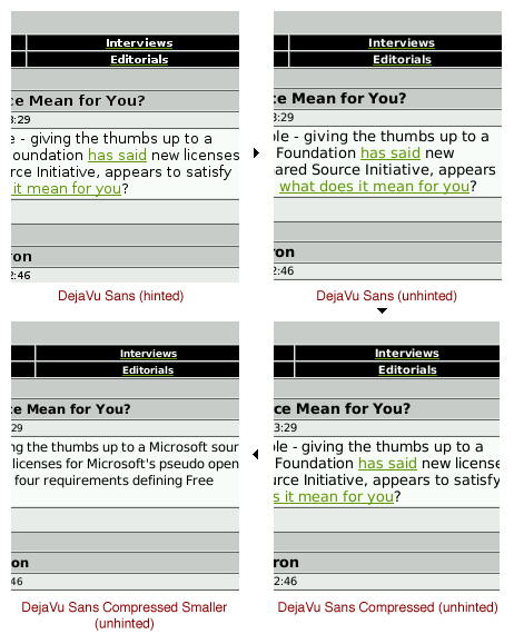
As I see it, the main problem with the DejaVu font (and Bitstream Vera therefore) is the spacing between the glyphs which tends to be too wide. This is observable in Windows and Qtopia. Especially on a PDA screen this is not a pleasant view.
So, what I did was to create a tweaked version of the font, again using FontLab.
Lowering the left and right sidebearing of each glyph by 18% resulted in the “DejaVu Sans Compressed” version you can see on the screenshots.
Now, still finding the glyphs to be too big, I applied a 90% scaling to each. In my opinion the resulting version “DejaVu Sans Compressed Smaller” looks really nice and comes very close to the quality of the C*libri font.
I’ve made the fonts available here:
http://katastrophos.net/zaurus/fonts/helvetica-replacements/free/
You can find additional screenshots here:
http://katastrophos.net/zaurus/fonts/helvetica-replacements/
Hi Andre,
I really like these fonts, but I have some questions for you:
How do you install them? I’m interested in the DejaVu Sans Compressed. I assume you just tar -xvf into your /home/QtPalmtop/lib/fonts directory.
What is the difference between these files?
BigPack-DejaVu_Sans_Compressed_Smaller.tar.gz
DejaVu_Sans_Compressed_Smaller.tar.gz
I already have the Calibri font set installed and have had no end of troubles with:
– alarm messages from the Calendar application (seems to lockup the UI)
– running the help viewer (same)
– changing date/time
Thanks,
Doug
Hi Doug,
the BigPacks include more font sizes. Since the fonts are essentially bitmap fonts and not vector fonts, they tend to be really big. So, that’s why I made available two packs of each font. I’ve you are doing word processing on your Zaurus, the BigPack is for probably better suiting, since it also includes font sizes that are unusual for normal PDA use.
Also, I don’t have any problems with the C*libri font. However, these MS fonts have been removed from this site on request. So, if you have any problems with the font just use the DejaVu font and extract it to /home/QtPalmtop/lib/fonts.
Regards,
Andre
Wow. I can’t believe what a difference your work has made. Good job!
Like Doug, these fonts are at the root of my problems with Help Browser and NeoCal freezing the UI. I’d recommned that anyone *not* hellbent on aesthetics leave them alone. If I had known, I don’t think I would have let beauty trump functionality.
Well, E.J., which fontpack did you use? Doug was talking about the Calibri font, which I removed. I have no problems with my fonts on Cacko on my 750.
Which ROM do you use? What Zaurus?
Ah, that seems to explain the problems I was having with neocal and the help browser… I had installed your DejaVu fonts–they really look much better–and sometime later I noticed that neocal would consistently freeze the GUI, and the HelpBrowser seemd to fail (but as I recall, it didn’t cause the GUI to freeze).
I’m using an SL-6000, with the original Sharp ROM.
Thanks,
Mark
I have just installed the DejaVu fonts from your package (Fonts_BigPack-DejaVu_Sans_Compressed_Smaller.tar.gz).
They are looking quite good but I have one annoying problem with the fonts.
Capitalized german umlauts (ÄÖÜ) are displayed without the dots. They are not distinguishable from AOU. It seems that the line height is too small to display the dots. I think that must be repaired in the vector fonts.
Can you confirm the problem and correct it?
Thank you.