Ever since using my Zaurus I had this idea of having OS X style smooth fonts in Qtopia. While the Trebuchet font introduced with Cacko was already good, it still didn’t cut it.
Today and after tinkering a while with FontLab and makeqpf I finally came up with something very close to the font smoothness known from OS X.
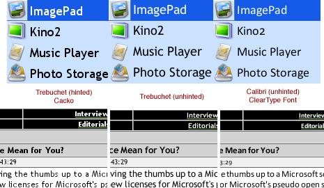
I removed the hinting from the font via FontLab, so the FreeType2 rasterizer in makeqpf could do the full antialiasing magic. The unhinted Trebuchet font seems to lose some of the crispness of the hinted version, however, the Zaurus screen with its higher contrast almost alleviates this effect. Clearly, special Cle*rType fonts like C*libri, C*ndara and C*ndel really live up to their promise as soon as hinting is removed – even without sub-pixel rendering they look superb on the CG Silicon screen. :)
Screenshots:

Sadly, most font-related settings are hardcoded in Qtopia 1.5.x. The only sane way to change the font globally is to replace the standard “helvetica” font with a replacement font…
Update 3 (December, 9th 2005): Downloads of Trebuchet and C*libri fonts have been removed. Please use the open-source DejaVu font in Part 2 instead.
Update 2: You can find Part 2 here.
Update 1: I’ve made some additional font packs and the makeqpf tool available here.
Tried it out with Calibri and it looks really good on my 6000. Thanks!
man these are sweet! Trying theme out and are fantastic to look at.
thanks a bunch.
Installed the Trebuchet onto my 5500…welcome and awesome improvement.
Thanks for the work!