Touch support for UI components
Component |
Example image |
Touch support |
|---|---|---|
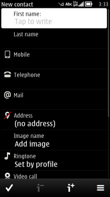 |
In the view state (a normal two-row list item), a tap activates it. In the edit state, the highlight is visible all the time but it works with a single click. One tap moves the highlight and launches a touch input window. Within a focused item, the functionality is as for a text field. |
|
Setting items |
||
Pop-up setting |
 |
A single tap activates the item (emulates a selection key press). |
Multi-selection list setting |
 |
The functionality is as for a multiselection list.. |
 |
The cursor can be moved with the text field. Dragging selects a block of text. |
|
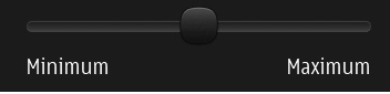 |
The slider thumb is draggable. |
|
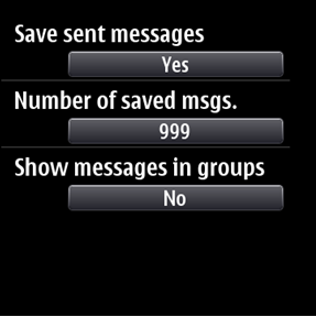 |
Tap toggles between values (Yes/No) or opens related setting adjusting view. |
|
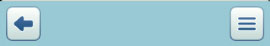
Iconic Softkeys (Left, Back and Right options). |
 |
A non focusable item. One tap to activate. |
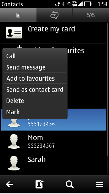 |
Shows the item-specific functions related to the item it was launched from. It is activated with a long press. |
|
 |
A nonfocusable item. One tap to activate. |
|
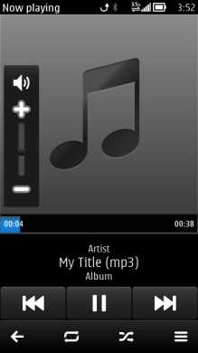 |
Draggable slider thumb. Icons can be set as tappable. Volume slider thumb is draggable, and muting can be done directly by tapping the speaker icon. |
|
 |
The Toolbar emphasises key functions within an application view. There are a maximum of two important functions shown in the Toolbar. Toolbar buttons are located between the softkeys |
|
 |
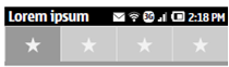
Nonfocusable items. Status bar opens into Status panel by dragging. |
|
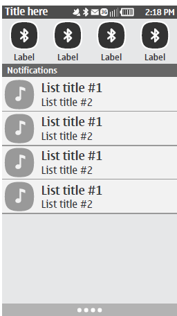 |
Component opens by dragging down the Status bar. Status panel items work with single tap. |