Grid types
Grids are in many ways analogous to lists. However, there are some things worth noting:
- In grids, the Arrow left and Arrow right keys are always used for moving the focus; they cannot be used in any other way that may be possible with lists.
Grid layouts are not as standardized as lists; the layouts must be designed case by case for the applications. Typically, grid items occupy less screen space than list items. This results in grid items having fewer elements than list items. A grid item may in general have one text, or one graphic, or a text and a graphic.
The following grid types can be used, and they are analogous to the corresponding list types:
| Grid | Description |
|---|---|
Menu |
For selecting one item; no Options menu. |
Selection |
Permanent state; can be left pending, the Options menu is available. |
Markable |
A selection grid with the marking function. |
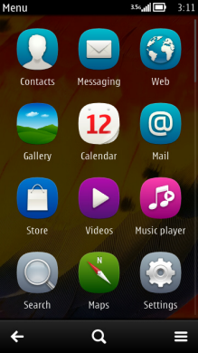
Figure: Main menu grid
Using grids in applications
The APIs to use for grids are the Grids API and the Lists API. For more information, see Symbian C++ API specifications.
The CAknGrid class is used to set up the basic parameters of a layout in terms of number of columns and rows, cell size, and orientation. After this, AknListBoxLayouts is used to set up detailed parameters for graphics and text in the cell. The following cell parameters can be set:
Location and size of bitmaps
Location and size of text string
Font and its color
Text align in the allocated space
Bitmaps are loaded manually, as an icon array.
Other parameters of visual elements (for example, highlighted text color) are used from the Symbian Developer Platform standard look and feel module; these should not be overridden unless you've instantiated your own class. For more information, see Symbian C++ API specifications.
Several specialized grid classes can be found in AVKON.
Use the class CAknCaleMonthStyleGrid to show a month view. The first row shows the day and the first column shows the week number. The following data can be set for an item:
Outlined icon to show border, dimension 21 x 9 pixels
Marking icon in the bottom right corner of a cell, dimension 5 x 5 pixels
Two-digit number
Use the class CAknPinbStyleGrid to show application shortcuts in a 5 x 5 cells grid. For every item, an icon is specified that is displayed in the center of a cell. In addition, two small icons, 13 x 13 pixels, can be specified. The first one is displayed in the top-right corner for marking. The second one is displayed in the bottom-left corner to show the target application.