


UI design in Harmattan applications
The user interface in MeeGo 1.2 Harmattan is based around the swipe gesture, which allows for fast traversal between focus areas and minimal clutter that would take away focus and screen real estate from the main applications. This section describes the basics of UI design for Harmattan devices, but it is also recommended that you read the full Nokia N9 UX (User Experience) Guidelines.
UI overview
The user interface in a MeeGo 1.2 Harmattan device has four main areas, as shown in the figure below.
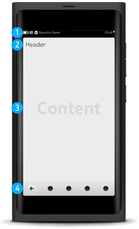
The areas are:
- Status Bar shows device info such as battery level, network, missed notifications and presence status. Tapping Status Bar opens the Status menu.
- Header Bar is an optional section of the content area (see below) that is usually reserved for the title of the current application.
- The content area is the area in which the bulk of the application interactions take place.
- Bottom Toolbar either provides fast access to the most commonly used functions in the current view or tabs to navigate within the application. Back button is always placed to the bottom left corner and Menu button to the bottom right corner if they are in the current view.
When developing application user interfaces, the vast majority of your activity is likely focused on the content area. The Status Bar is completely off-limits and the Header Bar and Bottom Toolbar have relatively strict limits for UI design. For information on the Bottom Toolbar, see section Using Bottom Toolbar.
UI design
MeeGo 1.2 Harmattan offers the option to implement the application UI with the high-level Qt Quick Components. Qt Quick Components are UI elements such as Buttons and Progress Bars that you can initialise and customise with QML, a newcomer-friendly scripting language with a declarative syntax. Qt Quick Components have attributes such as dimensions, colour and activated events. Every UI designed with Qt Quick Components automatically supports both landscape and portrait orientations. All in all, Qt Quick Components offer an approachable and intuitive method for UI design on the Harmattan platform.
In addition to normal coding processes in the Qt Creator code editor, Qt Quick UI elements are integrated into the Harmattan development process with the Qt Designer tool that is activated with the Design button in the Qt Creator main view. Qt Designer is a visual design tool that allows you to drag and drop and customise the UI elements as you go. In addition, Qt Designer gives you instant visual feedback on the application layout changes as you edit the settings. All changes are reflected in the underlying QML code that you can also edit by hand.
To use QML-based Qt Quick Components, create an application skeleton with the Qt Quick Application project creation wizard, as described in Creating and running a Hello World application. The default project is fully Qt Quick compliant, and you do not need to touch the underlying C++ code.
If you want to add the Qt Quick Components capability to an existing project, you need to initialise the QtDeclarativeView class, which creates a UI widget containing the area where Qt Quick Components can then be placed into. This is done with the following line:
#include <QtDeclarative>
To create a full screen QtDeclarativeView object into your application, insert the following snippet into the main loop of your application:
QDeclarativeView view;
view.setSource(QUrl)"qrc:/<location to your qml file>"));
view.showFullScreen();
In-depth topics
Harmattan devices feature an extendable theme architecture that allows you to, for example, create your own icon sets and customize existing ones. For more information, see section Themes.
The central concept of Harmattan UI is touch-based interaction. Different UI elements support may benefit from types of gestures and control methods. For more information, see section Gestures.
Mobile application user experience can also be enhanced with sounds and haptic feedback. For more information, see section Non-visual feedback.
Qt Quick components gallery examples
Qt by Nokia provides two Qt Quick galleries example applications in Gitorious:
- Qt Quick components gallery example demonstrates the use of Qt Quick components in pure QML
- Qt Quick components extras gallery example offers some additional Qt Quick components in pure QML.
While the source codes for the examples are best viewed and downloaded from the above Gitorious links, you can install both examples on your device from the developer mode panel after you have activated developer mode. To do this, open Settings --> Security --> Developer mode and select the Examples package for installation. Both Qt Quick components gallery examples are in the qt-components-examples package.
Further information
For more information on the Harmattan UI, see the following links:
- For instructions on creating launcher icons, see the tutorial in the Nokia Developer site.
- For an overview of designing UI-based applications for Harmattan, see Designing for MeeGo 1.2 Harmattan in Nokia Design and User Experience Library.
- For detailed descriptions and illustrations of Qt Quick Components within the Harmattan context, see Component Library in Nokia N9 UX Guidelines.
- For code snippets and tutorials for using Qt Quick Components, see QML Examples in Qt Developer Network.
- If you are designing custom icons for your applications, refer to the Launcher Icons Guidelines (pdf) document to align the graphic look with the overall Harmattan user look-and-feel.