Toolbar
The toolbar offers quick access to two key functions in the application view.
A tooltip information pop-up must be shown for each toolbar button that is visible. A tooltip is not available if the button is dimmed.
The following toolbar button types can be used:
A Command button offers direct action (functions/view access) like Send or New contact with a button press feedback. A related tooltip indicates the function of the button. The command button may have a long press functionality included, such as Fast forward.
An ON/OFF button can be used for activate/deactivate type of functions such as Loudspeaker or Font italics. The button can have related latched-down effect. The button icon graphic and tooltip change when the function is toggled, and should always indicate the current status.
A Mode toggle button can be used for switching between several modes. The button icon graphic and tooltip change when the mode is toggled, and should indicate the current status.
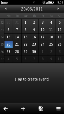
Figure: Calendar application toolbar
Toolbar buttons are view specific, thus within one application some views may have toolbar and some do not. It is recommended though to keep the toolbars as consistent as possible within an application. Changing toolbar buttons within one view is not allowed, but button can be dimmed in case function is not available, for example, depending on the focused item in the view or currently available services. An application may change the buttons according to product concept.
Using toolbars in applications
The APIs to use for creating a toolbar are the Toolbar API for the toolbar itself and the Generic button API for the buttons in the toolbar.
For implementation information, see Enabling quick access to functions with a toolbar.